oEtG Forum

Show Posts

This section allows you to view all posts made by this member. Note that you can only see posts made in areas you currently have access to.


Messages - sael

Pages: 1 2 3
1
Art / Re: Art proposals
« on: January 23, 2024, 09:02:13 pm »
wow those look stunning!
do you know if we have permission to use them in the game?

2
Events / Re: Community Deckbuilding challenge: a Gauntlet of Mages
« on: January 14, 2024, 06:43:05 pm »
this can barely kill a mage, but is the best I can do. :fire :earth

035aa0658u0258s055f0065f1025fl065fa018po

3
Events / Re: Team Quest Design: Design a New Quest
« on: January 03, 2024, 09:57:22 pm »
Hello there! I'd love to participate!

4
General Game Discussion / Re: Happy 10 Years, openEtG!
« on: December 08, 2023, 11:52:34 pm »
Happy birthdayHappy birthdayHappy birthdayHappy birthdayHappy birthday

5
Events / Re: Labyrinth
« on: March 01, 2021, 05:53:41 pm »
I'll be a Cleric! At least if no one else wants to be...

CLERIC

6
Events / Re: Tournament - The Tortoise and the Hare - Match results
« on: February 26, 2021, 03:43:17 pm »
sael 2 - 3 serprex
sael 1 - 3 Septima Rhay
sael 3 - 0 pizzaharald
sael 2 - 3 Neopergoss

7
Events / Re: Tournament - The Tortoise and the Hare - Sign-ups
« on: February 18, 2021, 02:58:49 am »
I'm in! Hare is fine

8
UI/UX Suggestions / Re: Renew UI and UX main menu into TABS
« on: February 07, 2021, 04:06:12 pm »
What would go (from the main menu) in each tab?

this is tentative and open for debate. The main idea is actually that the new menu with tabs can be very flexible, since there is a ton of available space and better organized.
A first approximation would be:

Battle
  • commoner
  • mage
  • champion
  • demigod
  • arena 1
  • arena 2
with columns for cost - reward for each,
+the things at the right side (gold, account, current deck, tips, invites)
+PvE stats at the right side


Deck
  • current deck selected
  • List of quick access decks (aka favorites) maybe with an edit button at the side of each (top 10?)
    (maybe a space for little notes or stats at the side of each, like for example upped/unupped)
  • new deck
  • Arena deck
  • view all
+the things at the right side (gold, account, tips, invites)


Cards
as shown in example.
Maybe library should be changed to "my library". And then other players library on players tab.

Players
  • My stats full display (name, PvE, PvP, gold, +???)
  • Send PvP invite:  this one can go here, in battle tab or both)
  • Search player library:
  • Leaderboards
  • Full display dedicated invites list (all pending)
+the things at the right side (gold, current deck, tips)

Quests
  • Tutorial
  • Daily challenges
  • Notifications for current running events
  • Quests
+the things at the right side (gold, account, current deck, tips, invites)


That would be the most like the current arrangement. What I think is important to notice is that more space would allow for implementing a ton of new choices. Want a friends and enemies menu? add button or even small display to players tab! Want to see what are the newest implemented cards? Add display on cards tab. Want to add stats for particular decks? add button next to deck list.
Just some ideas from the top of my head. I hope that gives you a more complete visualization :)

edit: FINAL NOTE: There is also the possibility of adding one or two new tabs, or fusing some of the ones that I proposed into one. I feel 5 is a good number and looks pretty neat, but in case of necessity, it can be done.

sael

9
UI/UX Suggestions / Renew UI and UX main menu into TABS
« on: February 07, 2021, 02:47:49 pm »
UPDATE: adjusted lightness and highlights to make image more legible with low brightness monitors.

Hello friends of the elements!  :chroma

I have been working for several days now into restructuring the main menu screen, in order to modernize it a little in accordance to modern gaming menus, where the different options are divided into different screens or sub menus. In this case, after arguing a little with people from the community we arrived at the idea that tabs would be the way to go.
This would help to 1° be less overwhelming to new players, being easier to read, and 2° it gives us a lot of free space, which means that we could add a ton more buttons and options for different purposes.
 
So after a ton of work, I made this:

Main menu background clean:
Spoiler for Hidden:


(note that the quality of the image lowers a little when uploading to https://postimg.cc/).
The metal slobs up there are the different tabs. Clicking or hoovering on them would show different menus inside the center plaque.

Here is an example (this is just illustrative) of how it would look like:

Main menu, "cards" tab:
Spoiler for Hidden:


This is just a sketch, but in this example the parts that appear in all tabs (account, gold, invitations from other players) appear on the right side, while the center and left side can be used for that specific tab. In this example, after you click on the cards tab and that menu opens up, you can then click on "shop", and that would take you to the current shop:


Entering the shop:
Spoiler for Hidden:


The same goes for deck editing, etc. After going to the respective tab, each button takes you to the current menu, since this would only affect the main menu.
So that's the basic preview. I would add that the center wooden plaque can be changed for something else (like a metal one) although after working so much on the wooden one I grew into it, and I personally prefer it. The same goes to say for the background, I have a few different options (like using the currently active dark wood background, or using a solid slightly textured grainy one) although I think this one is the one that looks better of them all.

Also, we could change the buttons and the typography in the future. It's up for discussion =) .
What remains to discuss is maybe, in the case the response is generally positive to the suggestion, then design a visual marker that let's you know in which tab you are currently in. I would wait for the programmers to tell me what would be convenient for that purpose.

So I hope you like it, eager to read your opinion !

edit: fixed typo on cards tab.

sael

10
New Card Suggestions / Re: Chromatic hatchling | Chromatic dragon
« on: February 05, 2021, 02:59:50 pm »
Uooouu the rewind :time idea is awesome! very flavoury.
I'm not sure about the ability cost retaining quanta identity thou. I think that plays with the idea of the dragon transforming into a certain element, instead of being all elements at the same time (and so using any quanta at any time).

As for power balance, think also about the chromatic pillars :chroma . They make three quanta per turn, instead of the regular 1. That makes me think that this dragon should be at least 2x times more expensive, or even 3x times, to hit around the same a regular dragon does. I honestly haven't thought about its mono application, it is something worth  considering. But nonetheless I think, if you have a mono  :darkness , it should be always obvious and more advantageous to use the  :darkness dark dragon instead of the  :chroma chromatic one. If not, then every mono dragon would become obsolete. I think that plays too against the idea of always paying the same quanta for ability. I think the deck you would want to see a chromatic dragon instead of a mono dragon, would be a deck that has AT LEAST two different elements, so it's design should be oriented to multiple element usage.

So IDK, I'm just gonna throw a stab in the air to see how it looks like:

Chromatic hatchling

4 :chroma
Costs 4 of your highest quanta.
6?: Transforms into Lesser Chromatic dragon.
1|3

Lesser chromatic dragon
Airborne. Token.
12?: Transforms into Greater Chromatic dragon.
Rewind only transforms it back to Chromatic hatchling.
4|6

Greater Chromatic dragon
Airborne. Token.
Rewind only transforms it back to Lesser chromatic dragon.
14|16

So in here, it's both the strongest and the most expensive dragon of all. With the first upgrade, you have +3|+3 for 6 :chroma , which is ok, if a little underpowered. On the second one +10|+10 for 12 :chroma is super duper cheap, since you pay 10 :darkness for a 10|5 dragon. maybe it needs nerfing? haha
It would also only be accessible by playing the Hatchling first, and then you get to the Greater one by the third turn. The good part is that you pay in quotas :) haha !

Another last idea could be making the hatchling and each subsequent growth consume one of your pillars as part of the cost? like, besides regular, it also devours a whole pillar. That would be neat and maybe help with balancing a little?

sael

11
New Card Suggestions / Re: Chromatic hatchling | Chromatic dragon
« on: February 04, 2021, 04:40:56 pm »
Hey, I think that adding some creatures to rainbow is a really worthwhile idea! and a chromatic dragon sounds super interesting.
First, a question: when you say "of your highest quanta" , let's say I have 8 :entropy and 7 :death . If it needs 7 :chroma, would it take 4 of :entropy and 3 of  :death, or would it take the 7 from  :entropy?
Another note (this is a personal opinion) but I feel like rather than using the upgrade game mechanic that is actually oriented to a different use, maybe it could be better to give the hatchling a paid ability for it to become lesser? You could even add another one to the lesser, even more expensive, for it to become greater! Very iconic.
One final note, a creature paid with any chroma has like a giant advantage, because it will always use the element that you have a surplus with. So maybe they should be weaker?? idk , just a thought. You can't underestimate the advantage of using any quanta surplus, it's huge.

Setting criticism aside, I think the idea has potential.

12
Art / Re: booster packs!!
« on: February 01, 2021, 01:53:00 am »
+Resized images to 160x256.
+Adjusted backgrounds accordingly.


  • Bronze
    Spoiler for Hidden:
  • Silver
    Spoiler for Hidden:
  • Gold
    Spoiler for Hidden:
  • Nymph
    Spoiler for Hidden:

sael

13
Art / Re: booster packs!!
« on: February 01, 2021, 01:27:30 am »
Deployed art

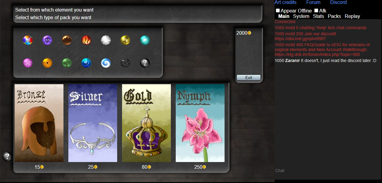
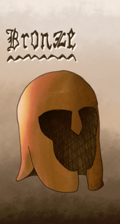
The art was out of bounds at given size, so resized 75% to 129x240 so it'd be nice if you resized to 128x240 or 160x256

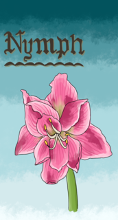
I should move the price below, since right now it's hard to pick a font color since bronze/gold have dark bottoms whereas silver/nymph have light bottoms
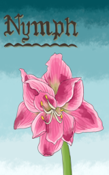
Sweet! :fire :fire It does look nice!
I'll resize to that size and send it soon. If you want me to put the prices on the images, I can do it with any custom typography. I could put a small box on one side in each image and write the prize there (I would post too a version without prizes just for backup if needed in the future). Alternatively I could turn around the backgrounds, in order to have the four backgrounds dark (or light) at the bottom (although I think it does look nicer when alternating).

Just let me know.
sael

14
Art / Re: booster packs!!
« on: January 27, 2021, 04:12:04 am »
+Corrected and updated Nymph pack text.

  • Spoiler for Hidden:


I feel like they are practically finished by now. I like how both the current background and the metallic one look with the booster pack images.
I'll be available for retouching them and try adding prize, text, etc tolook for ways to improve them after I see how they actually look in game. I'm up for changes in the UI, but we can do one step at a time.

Many thanks to everyone for the feedback, the final work would not look like this at all if it weren't for the help and comments of a lot of you.
And, again, I'm willing to try adding other details and retouching stuff once I see them implemented in game and see how they look like :D

sael

15
Art / Re: booster packs!!
« on: January 24, 2021, 04:03:09 pm »
Okay, I have more or less finished the four of them. Now it's time to polish details, of course.

bronze
Spoiler for Hidden:
silver
Spoiler for Hidden:
gold
Spoiler for Hidden:
nymph
Spoiler for Hidden:

+As timpa suggested, I have now unbent the silver circlet. Thanks!
+Also tried to do the background transitions a little rougher.
+Also separated a little bit the silver circlet from the borders, thanks Septima.

(I actually love the criss-cross shadowing in the bronze helm, so I am hesitant to change it =D )

It remains to decide:
-correct the "i" to a "y" on nymph. Sorry English speakers!
-separation between them
-add maybe foil pack/ sealed booster pack effect (the upper and lower parts press sealed)
-decide the final size (serprex, guide us! )
-decide if add the prize and the text for quantity and rarity of cards they contain

Any feedback is welcomed.

Pages: 1 2 3